This is the History of Film section, and this is its starting point: a short, opinionated map of how film got here. You do not need all of it to use the lab, but the looks we match every day were each invented by someone solving a chemistry problem, and knowing where they came from makes them easier to reach for.
Before color: the long black-and-white century
Photography begins in 1839 with the daguerreotype, a one-of-a-kind image on a silvered metal plate. It was a marvel and a hassle: long exposures, toxic chemistry, no copies. The wet-plate collodion process of the 1850s brought negatives you could print from, and dry gelatin plates in the 1870s and 80s made photography portable enough to leave the studio.
The real turn came in 1888, when George Eastman put flexible roll film in a simple box camera and sold it with a promise: "You press the button, we do the rest." That single idea, hand the chemistry to a lab so the photographer only has to see, is the original version of what a film lab does, and it is the lineage Department of Vibe sits in.
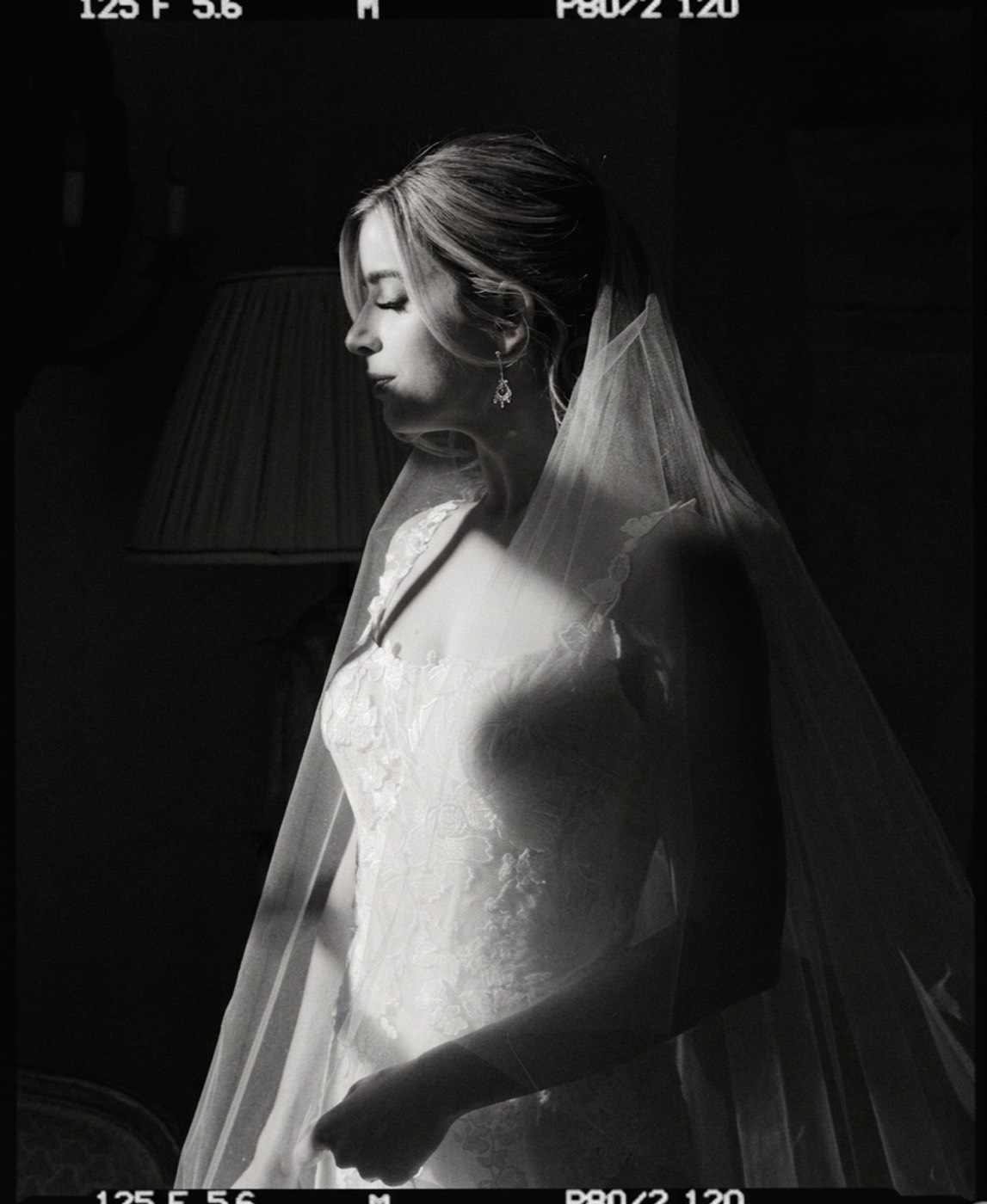
For roughly a century, film meant black and white. The look we now read as timeless, deep tonality, visible grain, the silver response of stocks like Tri-X, was simply what photography was.
Kodachrome and the color revolution
Color existed earlier in clumsy forms, but Kodachrome, launched in 1935, is what made color photography practical and beautiful for everyday work. It rendered color with a richness that held up for decades, and it trained the public eye on what a color photograph should feel like.
Color negative and slide films matured through the postwar decades. By the 1970s and 80s, color was the default and black and white had become a deliberate choice rather than the only option.
The stocks that defined an era
This is where the looks we still chase were set. Each major stock is really a set of decisions about color and tone:
- Kodak Portra became the professional portrait and wedding standard, built to protect skin above all. (See Tasting Notes: Portra 400.)
- Kodak Ektar brought slide-like saturation to a negative for landscape and travel shooters.
- Slide films like Velvia and Ektachrome pushed contrast and color hard, clipping highlights for punch.
- Consumer color like Kodak Gold put a warm, forgiving look in every drugstore, which is the film most family albums were actually shot on.
- Motion-picture stocks ran their own ECN-2 chemistry, and CineStill's trick of removing the anti-halation layer turned cinema film into the glowing CineStill 800T that still photographers love.
Reading those decisions back out of a single frame is its own skill, which we break down in how to read a film stock.
Why these looks still matter
Digital arrived in force in the 2000s and film nearly disappeared as a mass medium. Then it came back. Through the 2010s and 2020s a new generation, tired of clinical perfection, went looking for grain, color, and the forgiving tonality of film, and a revival took hold. Affordable stocks like Gold 200 became the gateway, and prices for the rarer films climbed.
The point of this section, and of the lab, is that these looks are not nostalgia for its own sake. Each one is a specific, reproducible set of physics: a color bias, a tone curve, a grain that reacts to exposure. Understanding the history is understanding the recipes, and the recipes are what we match. Browse the film stock library to see them applied.