This is Tasting Notes, a sensory read on a film stock, not a spec sheet. After CineStill 800T's neon, the opposite temperament: the stock photographers reach for when the subject is a person.
Kodak Portra 400 is the one that loves skin. Where a punchy stock fights you on faces, Portra forgives. It warms without going orange, holds highlights instead of clipping them, and keeps grain quiet enough to disappear. It is, quietly, the most-shot portrait film in the world, and the reason is the same reason it is easy to underrate: it doesn't announce itself. It just makes people look right.
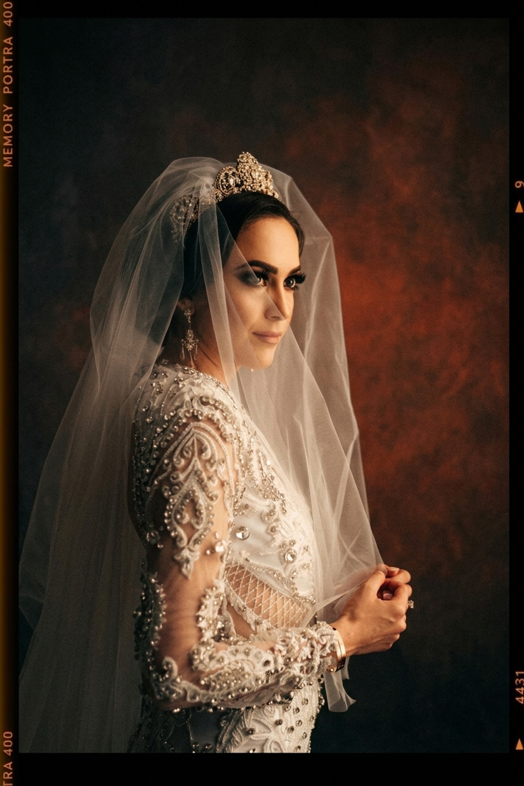
The look, broken down
- Color bias: warm, skin-first. Portra pulls the palette toward warm without tipping into orange. Reds and yellows stay flattering; skin reads healthy rather than ruddy. This is the whole reason it owns weddings and editorial portraiture. (More on how a stock builds its palette in film color science.)
- Tone curve: forgiving. Famous exposure latitude. Highlights roll off gently instead of clipping, shadows hold detail, and the midtones sit soft. You can overexpose Portra a stop or two and it thanks you for it. On a face, that gentleness is everything.
- Grain: fine, nearly invisible. It's a 400 stock but a clean one. Grain is present as texture, not noise, and it never competes with the subject.
- Saturation: restrained. Portra is not Velvia. It holds color back on purpose, which is exactly what keeps portraits from looking cranked.
The trap is treating Portra as "warm filter." Warmth without the soft highlight roll-off and the restrained saturation is just a tint, and it falls apart the moment a real highlight hits a cheekbone.
Match the look, keep the subject
Here is the same frame before and after matching Portra 400. Look at what changes and what doesn't: the color, the warmth, and the highlight roll-off all shift, while the person, the pose, the moment stay exactly as shot. That is the contract. Film never changed who was in the frame; it changed how they were rendered.

The point of Department of Vibe is that you don't dial twenty sliders chasing that warmth. You point at the look, and the engine brings Portra's color, grain, and roll-off onto your photo while the subject stays locked.
When to reach for it
- Portraits and weddings. Its home turf. Skin tones, soft daylight, white dresses that would clip on a harsher stock.
- Golden hour. The warm bias and gentle highlights make late light glow instead of blow out.
- Anything skin-critical at scale. Shoot a full wedding and the real test is consistency across hundreds of frames. Portra's forgiveness is what holds a gallery together.
- When you want the photo to feel like a memory, not a product. Restraint reads as timeless.
Where it struggles
Honest part. Portra is not a do-everything stock.
- Punchy landscapes. If you want saturated greens and electric blue skies, that's Velvia, not Portra. Portra will look flat and polite.
- Moody, high-contrast night. The drama of neon and halation belongs to CineStill 800T. Portra's gentle curve works against that mood.
- Overuse of its warmth. Pushed too far, the flattering warmth tips into nostalgia-by-numbers. A light hand keeps it timeless.
Match it yourself
Start from the Portra 400 look, or bring a reference whose warmth you want, a Portra frame, a magazine portrait, a still from a film. Either way: match the warmth, keep the photograph.