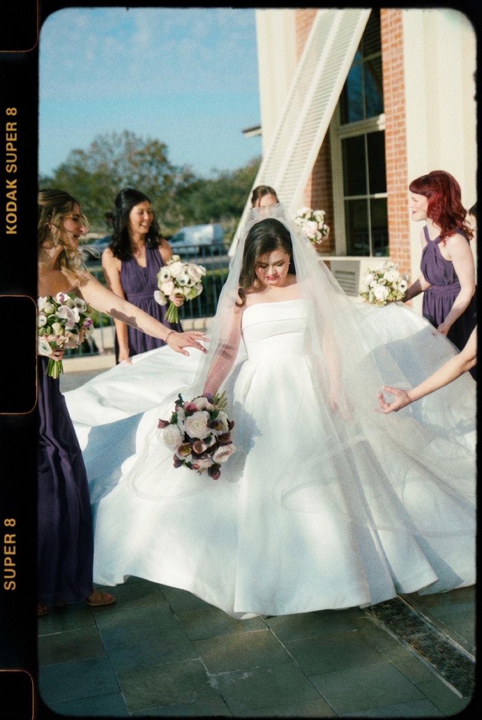
This is Tasting Notes, a sensory read on a film stock, not a spec sheet. This one isn't a still stock at all. It's a home-movie format, and that changes everything about how it feels.
Super 8 doesn't try to be sharp. It remembers. Where a clean stock records what was there, Super 8 turns it into something that already feels like the past: warm, grainy, soft at the edges, a little faded, like footage you found in a shoebox. That is the entire appeal, and the first thing a "vintage filter" gets wrong by adding grain without adding feeling.
Where the look comes from
Super 8 is an 8mm motion-picture format Kodak launched in 1965, built into a drop-in cartridge so anyone could shoot home movies. The frame is tiny, a fraction of a 35mm still negative, and that one fact drives the whole look. A small frame magnified means heavy grain, soft resolution, and a gentle vignette from the gate. Add decades of warm-shifting, fading color and the format becomes shorthand for memory itself. (For how grain, color bias, and tone build a film look, see film color science.)
The look, broken down
- Grain: heavy, and density-reactive. The small frame makes grain large and ever-present, but the key detail is that it isn't even. It clumps and blooms in the highlights and clears in the densest shadows, because it's silver reacting to exposure, not a layer laid over everything. A uniform grain overlay is the single biggest tell of a fake; real Super 8 grain grows where the light overloads the frame.
- Color: warm and faded. Aged Super 8 drifts warm and loses saturation, the look of color that has sat in a drawer for forty years. It reads as past tense.
- Resolution: soft, but under-resolution, not blur. This is the distinction most "vintage filters" miss. The detail was never recorded, not smeared away afterward. Fine detail should fade into tone while the form and silhouette stay coherent. A Gaussian blur on a sharp file hides detail that's there; Super 8 simply never had it. One reads as film, the other as a filter.
- The frame: gate and edge. Vignetting, the rounded film edge, sometimes the printed "KODAK SUPER 8" rebate. The format's own borders are part of the picture.
The trap is treating Super 8 as "add grain." Grain without the warmth, the fade, and the softness is just noise on a sharp photo. The feeling comes from all of it at once.
When to reach for it
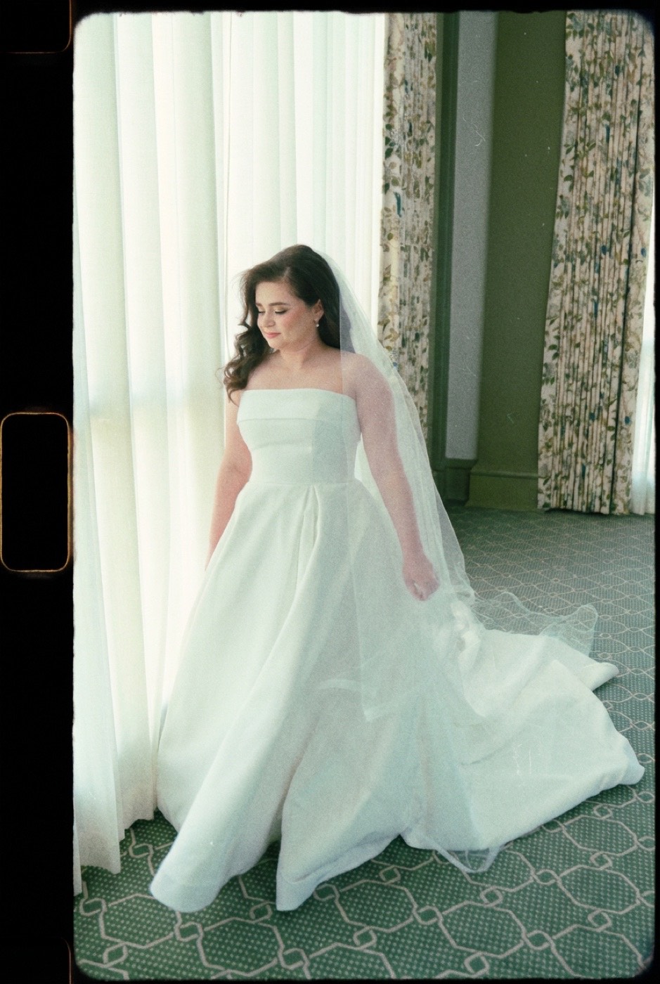
- Memories you want to feel remembered. Weddings, family, anything you want to read as cherished rather than documented.
- Nostalgia and "found footage." It instantly places an image in a warmer, older time.
- Intimate, human moments. The softness flatters candid emotion; it forgives and warms.
- Travel and golden light. Warm fade plus soft grain makes sun-drenched scenes glow like an old reel.
Where it struggles
Honest part. Super 8 is a feeling, not an all-purpose finish.
- Anything that needs to be sharp or clean. Product, architecture, commercial work that demands detail fights the format's softness and grain.
- Accurate color. The warm fade is the opposite of true-to-life. Don't reach for it when color fidelity matters.
- Overuse. Heavy grain and fade read as "vintage" fast. One frame is a memory; a whole gallery cranked is a costume.
Match it yourself
Start from the Super 8 look, or bring a reference whose nostalgia you want, an old home movie, a faded snapshot, a film still. Either way: match the memory, keep the photograph.