This is a Guide. Kodak makes two color negatives people constantly weigh against each other, and the choice is simple once you know what each was built for: Ektar is for the scene, Portra is for the person.
The short answer
- Ektar 100 is the landscape and travel stock. Vivid saturation, punchy contrast, the finest grain Kodak makes. It wants a colorful scene and good light, and it is less forgiving.
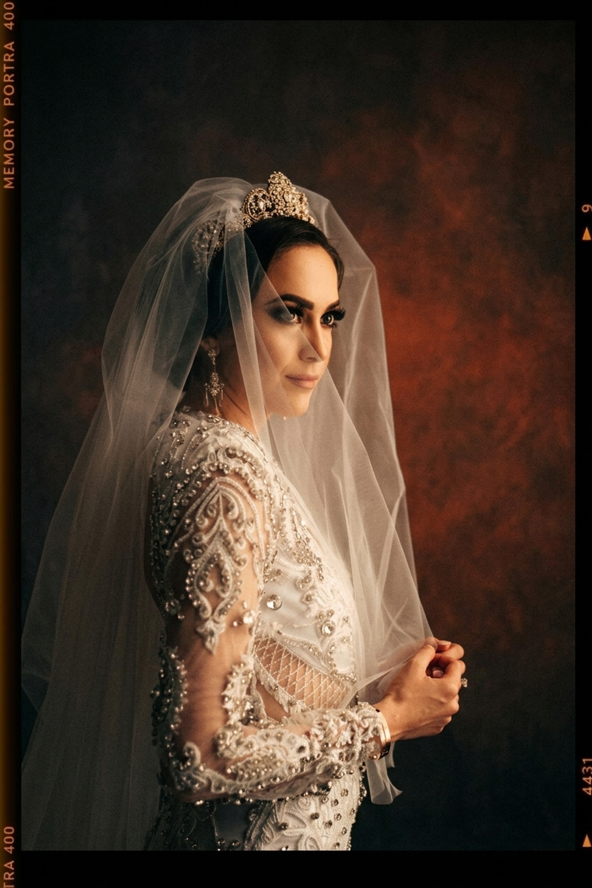
- Portra 400 is the people stock. Warm, protected skin, soft contrast, restrained saturation, forgiving exposure. It is the wedding and portrait default.
If color is the subject, shoot Ektar. If a face is the subject, shoot Portra.

Saturation and contrast
This is the headline difference. Ektar leans into color: deep clean blues, vivid greens, rich reds, and a punchy contrast curve that gives slide-film vibrancy on a negative. Portra does the opposite. It holds saturation back on purpose and keeps contrast soft, because cranked color is exactly what makes skin look wrong.
So the same scene reads very differently. On Ektar a blue sky goes electric; on Portra it stays gentle and the people in front of it stay flattering.
Grain and sharpness
Ektar 100 is Kodak's finest-grain color negative, effectively grainless, which is part of why it scans so cleanly for big landscapes. Portra 400 is also fine for its speed, but it is a stop faster, so it carries a little more grain and a little less bite. For pure detail and cleanliness, Ektar wins; for forgiving speed and skin, Portra does.
Skin: the dealbreaker
This is where most people actually decide. Portra's entire personality is skin protection, it keeps faces warm and natural even through hard light and rough exposure (more in Tasting Notes: Portra 400). Ektar's saturation and contrast can push skin warm or harsh, so it rewards careful exposure and a non-portrait subject (more in Tasting Notes: Ektar 100).
For weddings and portraits, that settles it: Portra. For a saturated landscape or a product on a colored backdrop, Ektar is the one that sings.
See both on your photo
The fastest way to choose is to see both looks on the same frame. In Department of Vibe you can match the Ektar 100 look and the Portra 400 look onto your photo and compare the saturation, contrast, and skin rendering directly, with the subject untouched. Match both, then let the subject decide.